Icon isone of the must-have skills forUIdesigners, andhow isa goodicondesigned?
Today we are here to give you a comprehensive knowledge summary of icon design:
First of all, consider the following points before making an icon (that piece of paper silently written down):
- What device is your icon mainly for?
- What style of icon is needed?
- Are there any other design requirements?
Let's move on to the design process:
1. The design starts with a grid
For different designs, we will use different sizes of grids. Let's take a 32*32 grid as an example.
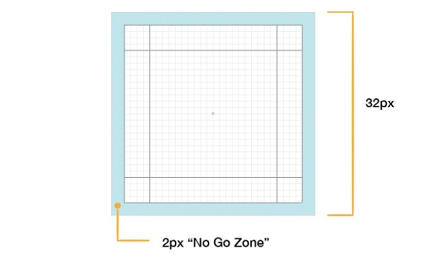
The 2pxof the edge of the gridis the untouchable part of my design, the white space. If there are no special circumstances, I will not let my design graphics enter into this edge boundary. The purpose of the white space is to keep the design from looking too full and to give the user a sense of breath.
The structure of an icon is divided into two parts: shape and direction. If your icon has a border, you will usually draw a shape like a square, circle, triangle, rectangle, etc. in the bounding box position as a border.
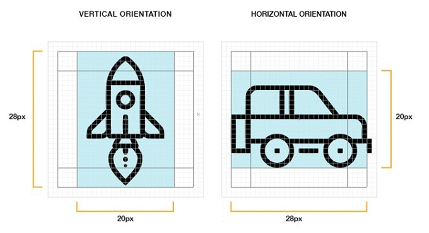
Circular icons will be centered in the grid. The four edges in a circular icon design will touch the edges of the content area, but not the white space. Some small shapes and corners will be outside the circle, but don't worry, this is a common occurrence.
Square icons are generally centered in the grid as well, but in most cases they will also touch the edges of the content area. Let's take a look at the following picture: the picture is divided into three square regions (blue, orange and green), with most of the graphics in the icons in the middle orange region. The percentage of graphics in each area depends on the overall visual effect of the icon, and this control requires some practice to get a feel for how to use it.
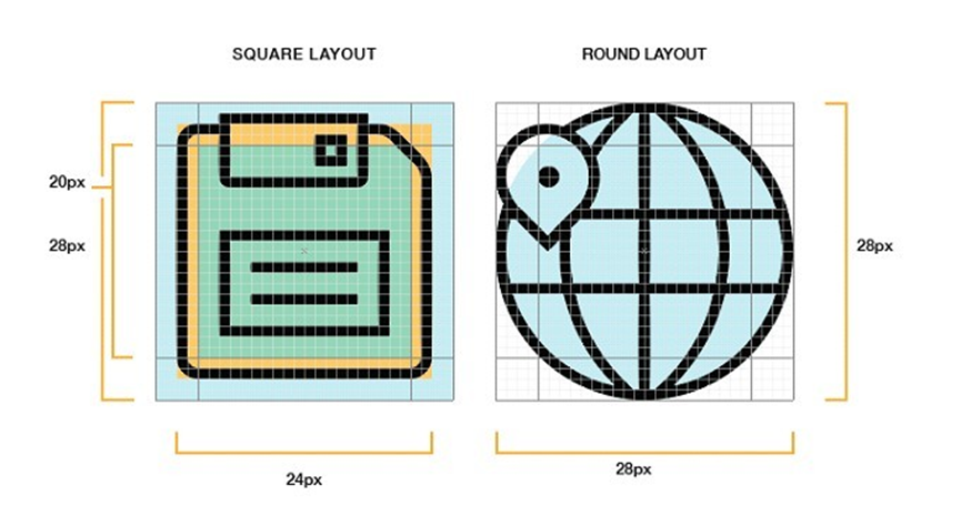
In a 32px grid, you will notice a 20px vertical and horizontal separation from the 28px, which is generally the rule you will try to follow when designing icons.
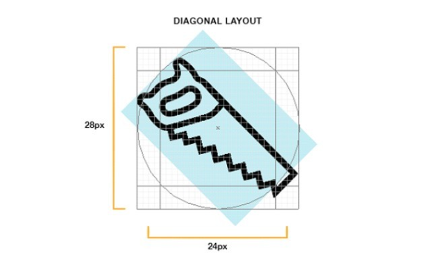
Irregular icon designs will use a circle to de-align as shown below. As you can see the graphic is already touching the edge of the circle, you don't have to be particularly precise here, just close enough.
But you have to remember that grid rules are not for all designs, the nature of an icon is much more than this rule set. Grids will help you improve the consistency of your icon designs, but if it's a choice between designing an awesome icon and following the rules, I'm sure you'll pick the awesome design too.
2. Start with a simple geometric figure
Designing icons is like sketching: start with a simple, rough circle, rectangle or triangle. When designing small icons, hand-drawn representations may not look as polished, so AIis a better choice. Designing with some basic geometry is more accurate (especially around the edges of the curves), faster to adjust, and more precisely adapted to the grid pattern.
3. Edge, Corner, Curve and Angle Specifications
As much as possible, edges, corners, curves and angles should be designed in a way that follows some mathematical norms without being too interesting. In other words, don't trust your eyeballs too much, but follow the norms in some details, because if these elements are not consistent, it will affect the quality of the icon.
Angles
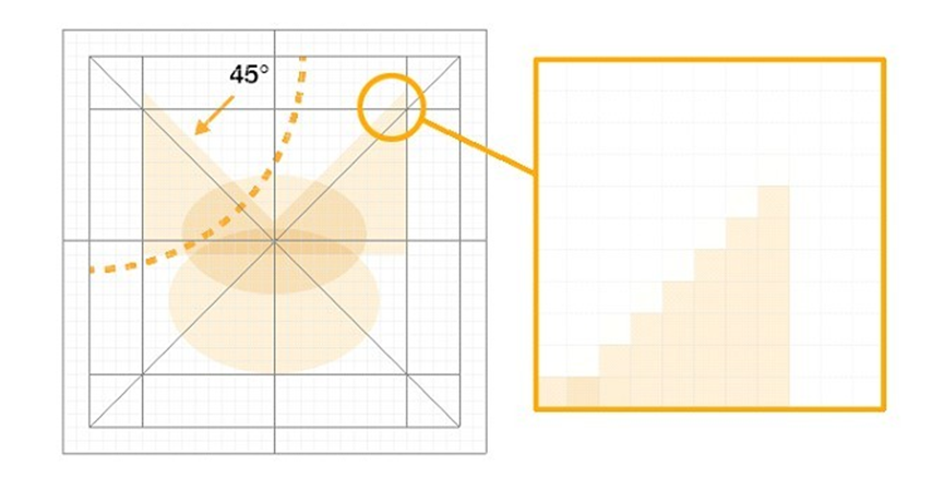
Most of the time I usea45degree angle or a multiple of it in my designs. 45 degree angles look uniform (and are stronger in pixels) and this perfect diagonal is comfortable and clear to the eye. This pattern also establishes the uniformity of a set of icons. If I were to break this rule I would probably use a halved angle (22.5or11.5degrees) ora multiple of15, and of course adjust accordingly. The advantage of using 45 degrees is that the rule is not broken even if the angle is reversed.
Curves
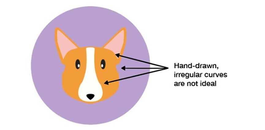
Curves are a special test of skill, even if the quality of the image is poor, one look at the curves will tell you how good the designer is. Moreover, the measurement of the human eye always has some small errors, and most people's eyes and hands can not reach such a high level of coordination, so use the shape of the software tools and some figures to create curves to achieve the effect.
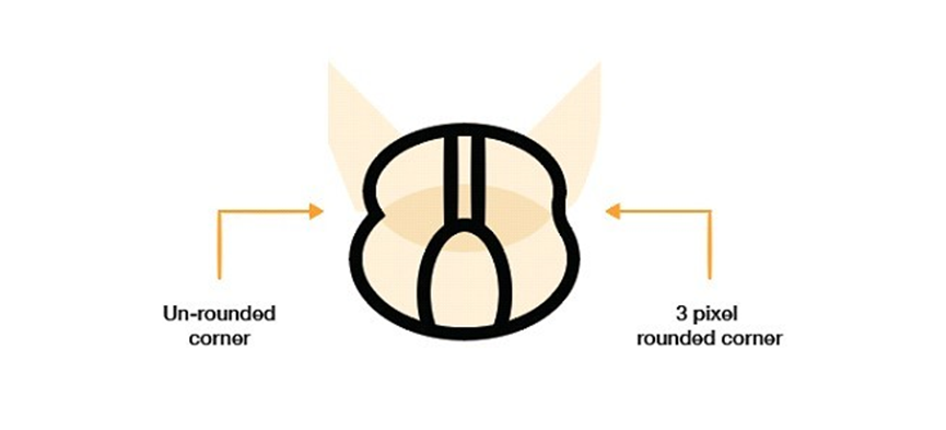
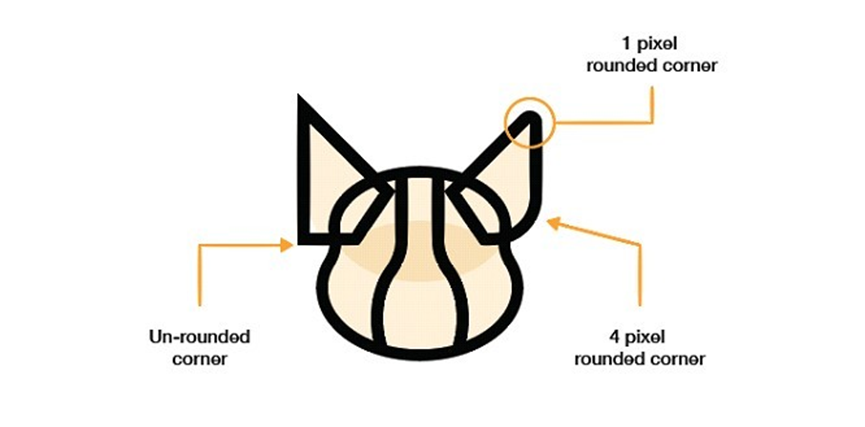
Corners
Rounded corners may not be used as much as they should be, and a 2px radius corner is obviously a circle. You have to choose whether to use rounded corners and how big to use them based on the general characteristics of your design.

Pixel effects
The pixel effect of icons is an important part of the user interface, especially in small-sized designs where it affects the overall visual appearance. If the row spacing in the pixel grid is not aligned, it will result in jagged edges and will look blurry on small icons. Adjusting the pixel grid of an icon will make the lines thin and the angles and curves less precise. This is why it is recommended to use a 45 degree angle, which is more manageable, more precise and easier to align.
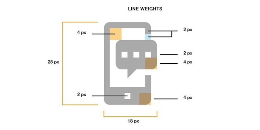
Line thickness
When it comes to line thickness, 2pixels should be ideal, but3pixels is the most versatile. I personally prefer 2px and 4px, and ideally I would use multiples of 2 more often. For the most part words and flat icons are to be avoided with particularly thin lines, unless you are trying to make some desired effect. If you want to define the shape of the line, generally designers will do it by means of light and shadow.
4. Unity through design elements and icon features
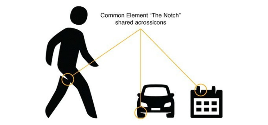
Designers will use a certain element to make a series of designs more unified. For example, a Dutch designer talked about his project for the Dutch government at the Icon Salon 2015, in which he and his partner used the element of "notch" in the design, which is not present in every icon, but most of the unity gives the series its own character. Not every icon has this element, but the unity of most of them gives the series its own character and really brings them together.
5. Restrained use of detail and decoration
The purpose of an icon is to communicate with the user, to make them think and make choices. Too much detail can add to the complexity of recognizing an icon, especially at small sizes where it can become cumbersome. Of course, the complexity of the details also affects the effect of individual icons or the whole series of icons. So when you can't decide how much detail is too much, the best approach is to consider a minimum of guaranteed detail, but with a high quality of clear icon meaning.

6. Uniqueness
Although we can see a great pair of bullish designers making high-quality icons, they focus too much on design trends and style imitation of other high-end designers. As a designer, creativity is probably what we should value more, and we can look for inspiration from other fields such as structure, fonts, industry, psychology, and nature. We've all seen the same icons, but the maverick you are is the style that users really recognize.

Here are some things you need to keep in mind during the design process:
1. Make it easy for users to understand
The most important role of an icon is to make it recognizable and understandable to the user. It's difficult for people to make their choices with small icons, so for brands, most of the graphic design is to showa logoor an iconic image ofthe brand. Of course for a new or small brand there are also some other ways to show it.
2. Icons are not images

An icon can contain an image, but it can also be a text, a logo or a combination of these elements. Image icons can be difficult to read on other adaptive devices, whereas graphics can carry more visual interest.
3. Avoid text
For an icon, words will not be used as content because the space itself is small and the content is not easy for the user to understand. This is also a lesson learned: if the text is notpart ofyourlogo, avoid it. If it is, give it some careful consideration.

Additionally, many icons are actually used in certain contexts, and most include a line of descriptive text below the icon. When designing, it's also important to keep the colors of the letters and the type of icon or website consistent so that you can build brand unity.
4. Use bright colors
Want your icons to stand out? Then go bold with colors. Choosing a vibrant color can help you grab users' attention and make your brand more distinctive. For example, blue, especially sky blue and navy blue, you may shy away from because this popular color isn't appealing. But if blue is your main logo color, you can try something new and neutral, like lime green, or choose a seasonal shade like bright orange for summer or pink for spring or something like that.
5. Make alogoextension
Your brand will have its logo, but once it becomes an icon, it's more like a sign. The logo can be a simple logo or image, it needs to be more direct and memorable to the customer. The brand also wants to create some connection between the logo and the icon to unify itself.
6. Usage of the icon

Icons are not limited to cell phones or computer desktops, so it is important to take into account the size and application of the icon when designing, so it is a better way to reduce the size of the icon after making it bigger. When it comes to the scale and size of the icon design, the format also becomes an important factor, in order to aspect of the application, vector graphics is your best choice.
7. The world outside the content
Recently there are a lot of icons using monochrome background with white icons, flat design combined with shadows, this trend is popular but don't limit yourself to this kind of design, do something different in your icons. While most people consider a square design, maybe you should consider something else. Adding a texture effect in the background will stand out from people's monochromatic colors.
8. Monochrome Challenge
There's an interesting tip designers have used for years to test the effectiveness of a design - monochrome mode. In monochrome, if your design conveys the same message then it is an effective design; if without color it becomes weak or even affects user recognition, then go ahead and modify it. There are also some designers who start with black and white to create a solid framework before adding color.
 鄂公网安备 42010202002647号